How writing will make you a better designer.
The great, revered designers in graphic design history created insightful, meaningful work that communicated.
Sure, it was beautiful. You can look at Lubalin’s typography work or Vignelli’s NYC subway map and marvel at the aesthetic qualities shown.

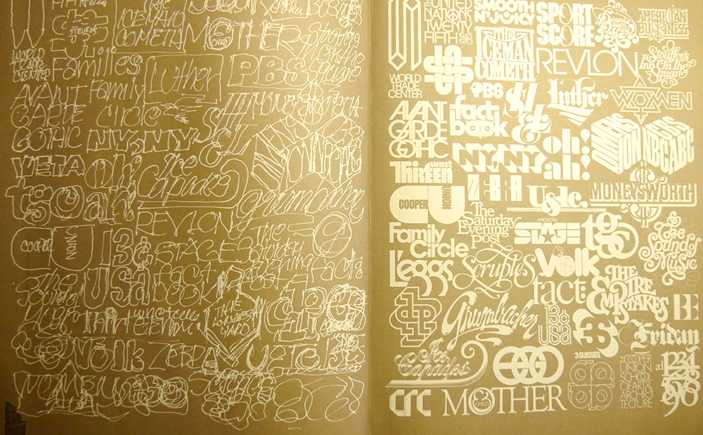
One of the many pages from my copy of the out-of-print book about Herb Lubalin
But these works aren’t famous merely because they are pretty. Lubalin and Vignelli are so respected because of their ability to communicate: the former’s logo work often revealed a hidden meaning within the letterforms or played some subtle metaphoric trick, while the latter’s controversial map untangled a complicated subway system.

Vignelli’s controversial NYC subway map
The design greats were/are writers, thinkers, and communicators. But somehow, either with the invention of the web or some other influence, that tradition has faded.
So many portfolios I see these days have little substance. The writing is poor and what little text exists in the design is only there to fill the space between retouched photos and illustrations. There’s little explanation about why the design ended up that way.
We even have entire communities built around the idea of showing off pretty work that’s completely disconnected from context and message. (I’m looking at you, Dribbble.)
Compared to the designers of the past, most of our work, myself included, pales in comparison. Not only do we often fail to demonstrate the purpose of our designs, but sometimes we create designs with no purpose at all—design has become and end in itself.
Great design is supposed to be timeless. What web designer could point to a single project and claim it’s as timeless as an Eames chair? I realize this comparison is a bit unfair, but I do think it reveals something about design culture.
Design has become more like a status symbol or luxury good; if you have a nice design, you’re legit. Quality design merely filters out the wannabe businesses.
As designers, we describe our job as positioning clients amongst all the noise—a shiny design will make a brand stand out.
But the hypothesis we fear is that a pretty design will make no difference at all.
What if we designers are actually adding to the noise by creating shallow work?
What if there were a better way to serve clients than with aesthetics?
I think I’ve found a way: through writing.
How writing made me a better designer
I’ve been running my own products business for the last couple of years. During that time, I’ve had to learn to do everything myself.
The biggest challenge came from writing.
I have to do all kinds of writing just to keep my business running: a weekly newsletter, blog posts, and landing pages. Even keeping up with social media posts—just writing tweets—can be daunting. That might sound silly, but it’s just another thing I have to write. I even went so far as to write an ebook.
Despite the fact that writing takes up more of my time than I ever could have expected, I’ve stuck with it. Looking back upon a couple years of regular writing, I was startled to realize that I approach a design completely differently than I used to.
A few years back, I tended to get excited about aesthetic concepts or features. Now when I start a design, the exciting part is connecting an audience with a great idea.
Of course we’ve heard these tired maxims over and over: content is king, design should serve the content, focus on the user, etc.
But after all this practice writing, something is different. It’s almost like I’m not even a designer anymore.
After this change, design is just a tool to help me get the message across. It’s an artifact created along the way—not the goal.
When I flip through my Lubalin book, that’s the common thread I see in his designs. In each case, he was obviously thinking about how to communicate. He had a clear picture about the intended reader, and used that knowledge to craft clever visual cues to enhance their understanding.
Now, I’m nowhere nearly so skilled as Lubalin. But I’m encouraged that the recent change in my work could mirror his reasoning. A while back, Sacha Grief did a write up of one of my landing pages. I think the only reason he wrote about my design was because of its harmony with the writing. More recently, Joanna Wiebe, author of the incredible CopyHackers books and probably one of the best copywriters anywhere, tweeted about my copywriting. Without me even being conscious of it, my work must have improved to earn those kinds of comments.
Somehow, my designs are better because I can write. My writing is better because I can design.
Now, I’m not trying to brag. I just think this is exciting. What could the design community accomplish for our clients and culture if we could lift our discipline beyond mere decoration?
The next time you’re looking to level up your design skill, try something different and make a commitment to write.
Maybe you’ll become the next Lubalin.
